
Project Summary
HeartPiece was a fictional music-producing duo I created during the COVID-19 pandemic as a way to explore original music production, visual world building, animation, and digital promotion under one cohesive artist concept.
The project was inspired by the bright, electronic Kawaii Future Bass music I had been listening to heavily around 2017, especially artists like Snail’s House, Subtact, and Hyper Potions. It felt colorful, energetic, alive, and almost animated with its use of playful synths, huge melodic hooks, and video-game-like qualities. HeartPiece grew out of that influence, while also drawing from my experience writing chiptune, video game music, and electronic music. I imagined it as a fictional artist project that could feel at home in a video game, an animated series, or a colorful electronic music world of its own.
One Song Every Month
My goal was to write, produce, package, and promote one original song per month. I kept that schedule for eight consecutive months, with each release taking more than 20 hours to complete across music production, cover art direction, animation, short-form promotional edits, and advertising.
Most of that time went into the music itself: writing melodies, designing synth sounds, arranging drops, shaping energy, and creating tracks that felt colorful, emotional, game-like, and harmonically captivating.
Naming, Characters, and Brand Identity
The name HeartPiece came from my love of The Legend of Zelda series. In the games, Link collects heart pieces and fills heart containers to increase his health, making him stronger as the adventure grows more difficult. I liked that idea as a metaphor—the music could feel like collecting small pieces of joy, energy, optimism, and emotional strength.
The logo started from the same reference point. It was an homage to the heart pieces from Zelda, but I wanted the final mark to feel more organic, soft, and expressive rather than purely geometric. HeartPiece was meant to carry a positive and uplifting message through both the music and the characters.
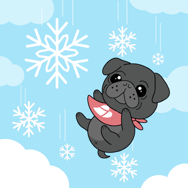
The characters also became part of the project’s identity. I imagined the main character as a playful version of myself, paired with a smaller turtle sidekick inspired by my pug, Charlie. Their dynamic had hints of the character relationships I loved growing up, including Curious George and Ted as well as the adventurous, affectionate spirit of Calvin and Hobbes.
Visual Direction and Cover Art Collaboration
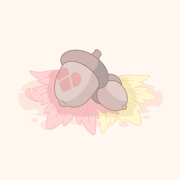
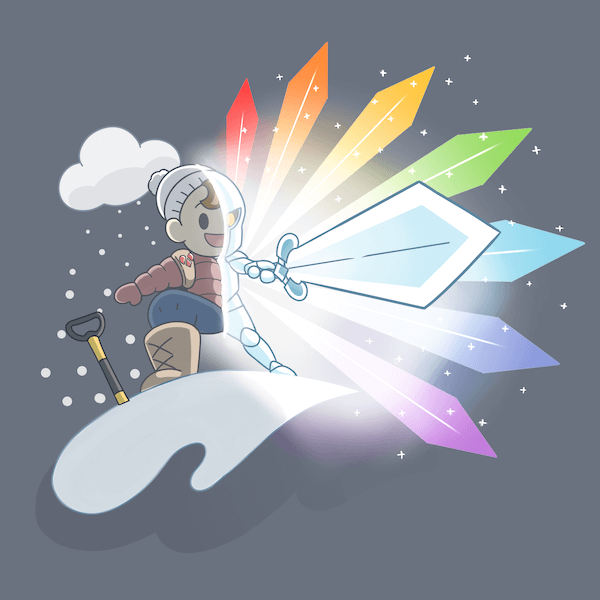
The visual side of HeartPiece became a major part of the project’s identity. For each release, I developed the creative concept for the cover art and worked collaboratively with @an_artist_astray (on Instagram) to bring the artwork to life.
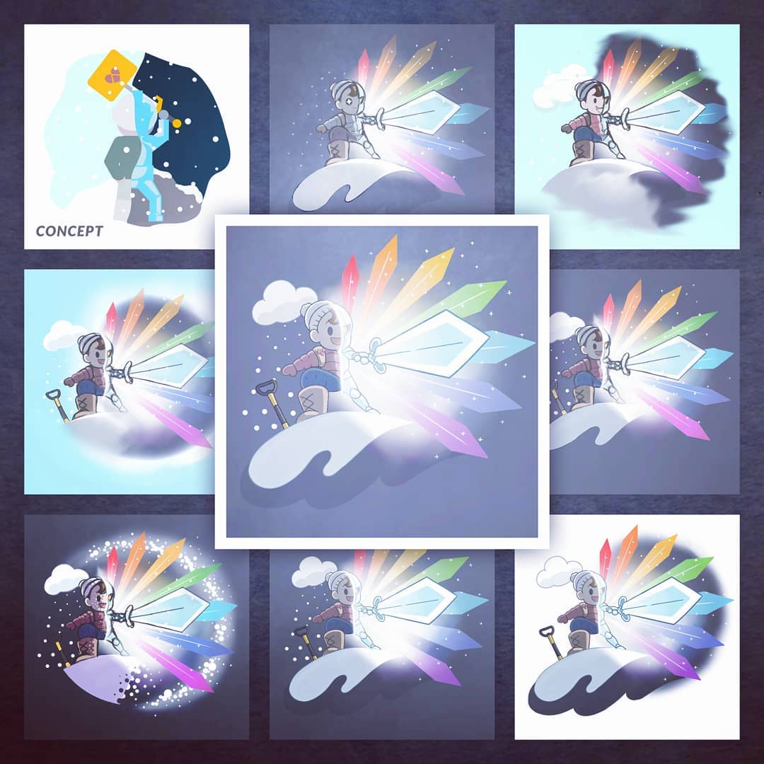
The process began with a concept, reference, or rough sketch from me. From there, we would go back and forth refining the illustration, character poses, colors, mood, and composition until the final artwork matched the feeling of the song. The attached examples show this process in action, moving from loose concept sketches and exploratory layouts into polished cover art.
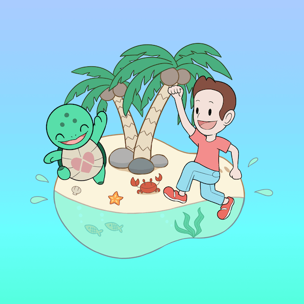
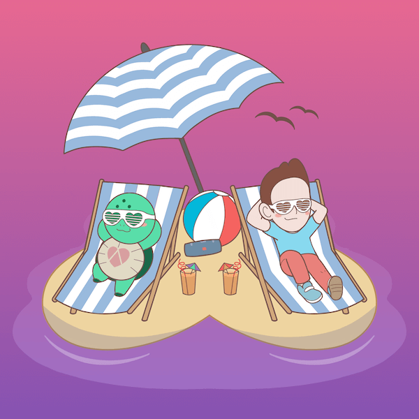
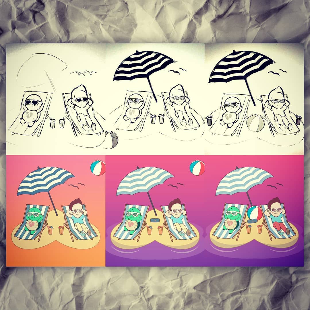
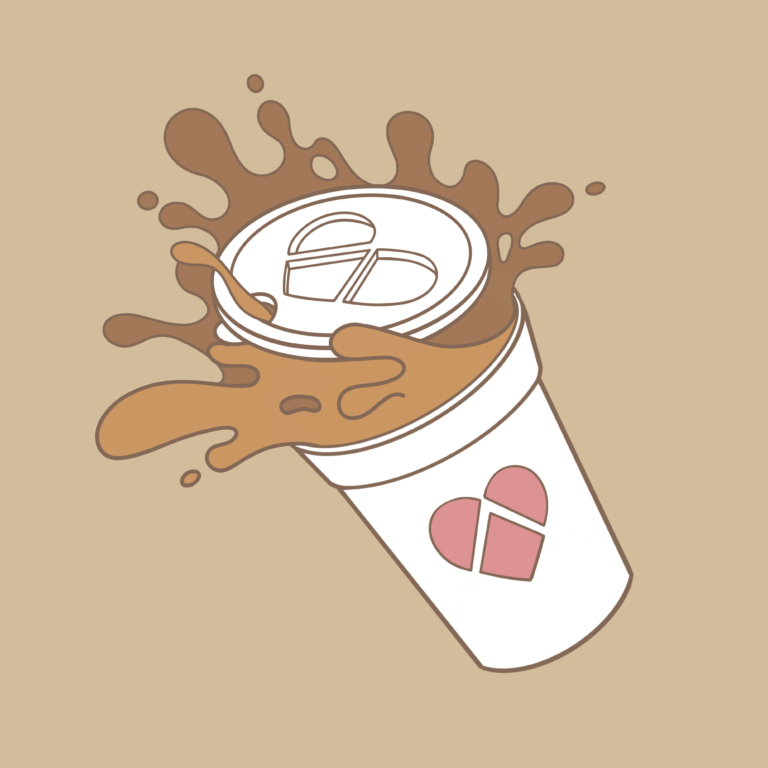
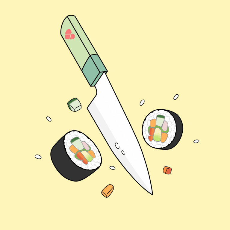
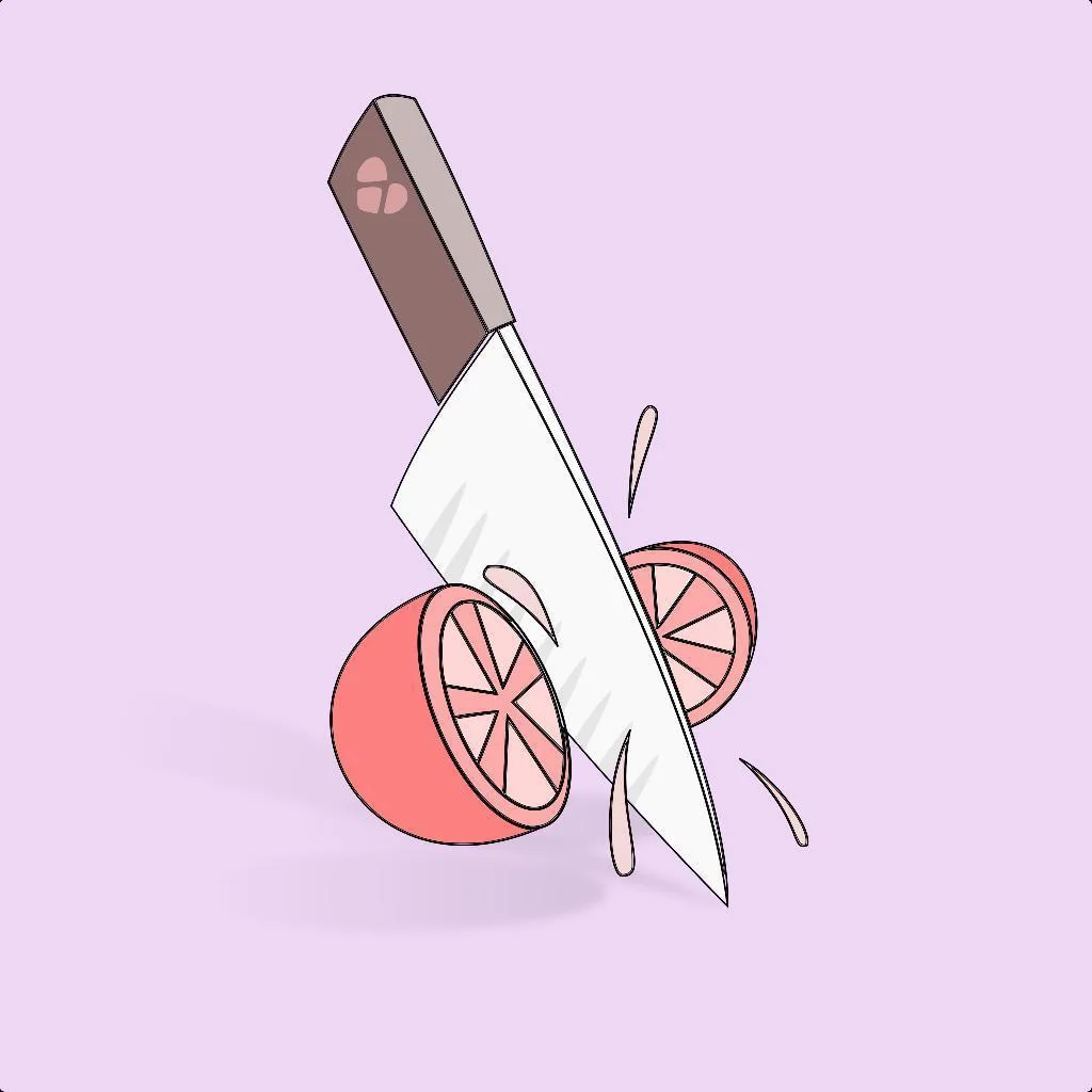
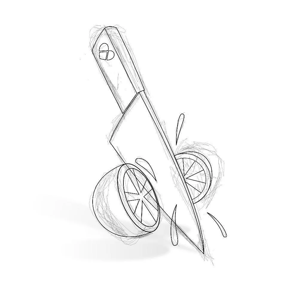

Over the course of the eight-month release schedule, the identity of the project began to evolve. At first, HeartPiece was presented as a fictional producing duo with recurring characters and a playful artist-world concept. As the project continued, I began branding individual songs more heavily around their own visual themes. For example, “Chop” featured a HeartPiece-branded knife cutting a piece of sushi in half, while “Caffé” featured a HeartPiece-branded coffee cup spilling out coffee.
That shift produced some fun visual ideas, but it also became part of the project’s challenge. As each release became more concept-specific, it became harder to maintain a clear, consistent identity for HeartPiece as a fictional artist brand. I still love the music and the visual experimentation that came out of the project, but the gradual drift in branding made it harder to sustain momentum and direction over time.
Animation, Advertising, and Promotion
HeartPiece became more than a music catalog. It was an experiment in building a complete creative product from scratch.
I produced the music, shaped the artist identity, directed the visual concepts, animated promotional videos, built the project website, created short-form edits, wrote ad copy, and placed paid social ads behind the releases. The project gave me a way to combine music production, illustration direction, animation, branding, web design, and digital marketing into one integrated release system.
At its peak, the project generated real industry conversations, including discussions with a Universal-signed rapper based in Japan. While HeartPiece remained an independent creative experiment, it became a meaningful test of what I could build when music, visuals, storytelling, and promotion were developed together.
Reflection
Looking back, HeartPiece represents an early expression of a creative pursuit that continues today—developing original products rather than only providing creative services. What began as a music and visual identity experiment has since expanded into film concepts, video games, software tools, and other self-directed creative projects.
It also taught me an important lesson about product identity. The strongest parts of HeartPiece came from having a clear world, a consistent emotional tone, and a repeatable release system. As the project evolved, I learned how easily a brand can lose direction when each new piece of content starts pulling the identity in a different direction.
Even so, HeartPiece remains one of my favorite self-directed creative experiments. It allowed me to combine music composition, chiptune, game audio, visual concepting, animation, web design, and digital advertising into a single artist brand. The promotional videos remain available on the HeartPiece Instagram channel, and the original website still serves as an archive of the project.
Credits
Related Projects
ShotCue AI
2026
Structured AI Video Generation Tool
UX/UI Design, Web Development
Frequency
2026
Phaser Game
Game Development, Producer, Product Design, Sound Design, Visual Design
Factor Commercials
2026
Ernie Clement Campaign
Production Sound
HourWise
2026
Time Tracking & Timesheet App
Product Design, UX/UI Design, Web Development
Accounting Hub
2025
Custom Finance Dashboard for Freelancers
Product Design, UX/UI Design, Web Development
Timeless Hearing Brand Video
2025
Regional Healthcare Brand Refresh
Audio Production, Creative Lead / Director, Production Sound
Forum Groningen’s Disney: Telling Timeless Stories
2023
Museum Exhibition
Production Sound, Voiceover
Rebirth
2022
Algorithmic Music
Algorithmic Composition, Music Composition, Sound Design